The Role of Data Visualization in Logistics Decision-Making
How effective data visualization transforms raw logistics data into actionable insights — chart selection, dashboard design, and cognitive principles that drive better decisions.
Why Visualization Is the Last Mile of Analytics
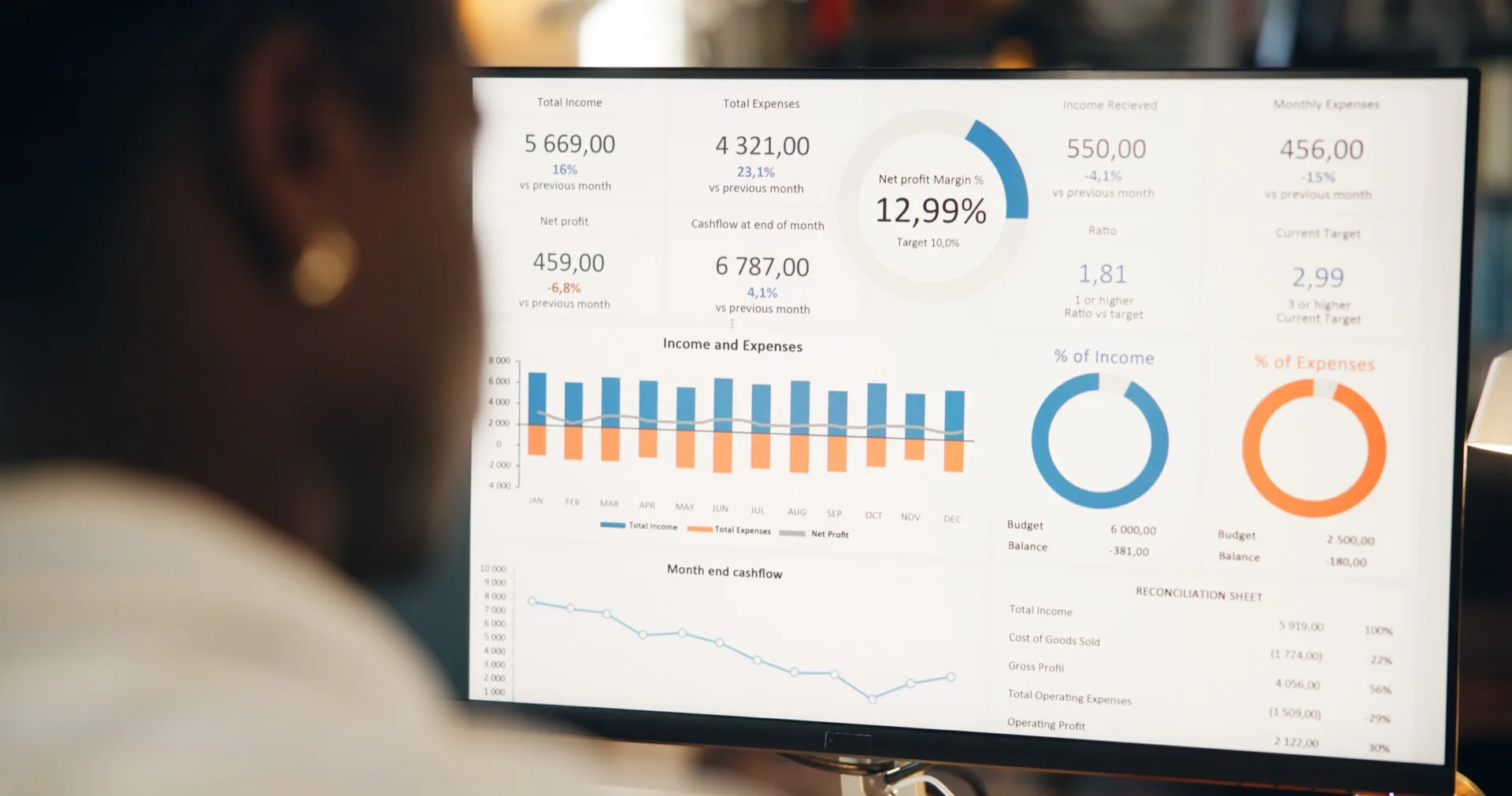
You can have the most sophisticated data pipeline in the industry, the cleanest data warehouse, and the most advanced machine learning models — but if the insights they produce are not visualized effectively, they will not influence decisions. Data visualization is the last mile of analytics: the interface between computation and human cognition. In logistics, where decisions are time-sensitive and involve multiple variables, the quality of your visualizations directly determines the quality of your decisions.
The stakes are concrete. A well-designed dashboard that surfaces a carrier performance anomaly in real time enables a proactive rerouting decision that saves a customer relationship. A poorly designed dashboard buries the same signal in a cluttered grid of numbers that nobody reads until the weekly review — by which point the shipment is already delayed and the customer is already unhappy.
Teams that lean on well-built visuals tend to reach decisions faster than those combing through tabular reports, because a chart lets the eye catch the exception the numbers are hiding. In logistics, where the window for corrective action is often measured in hours, that head start translates directly into operational performance and customer satisfaction.
Does Your Chart Type Match Your Question?
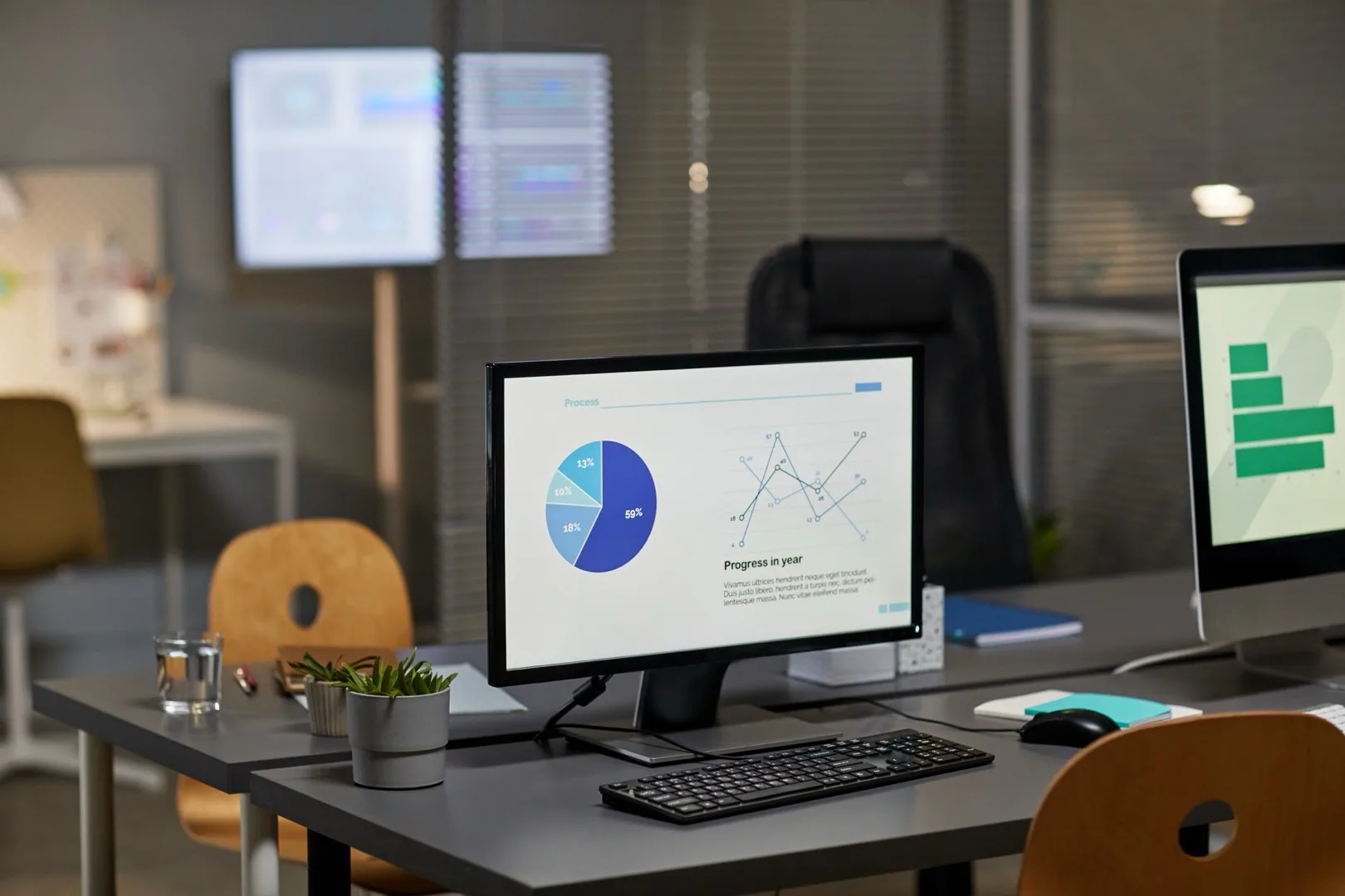
The most common visualization mistake in logistics dashboards is using the wrong chart type for the question being asked. Every chart type is optimized for a specific cognitive task. Using a pie chart when a bar chart is needed does not just look wrong — it actively impairs comprehension and slows decision-making.
Match your chart to your analytical question:
- Comparison across categories (carrier performance, lane volumes, cost by mode): Use horizontal bar charts. They are the most cognitively efficient format for comparing discrete categories. Avoid pie charts — humans are poor at comparing angles and areas.
- Trends over time (monthly shipment volumes, cost per TEU trajectory, on-time delivery rates): Use line charts with time on the x-axis. Add reference lines for targets or benchmarks. Limit to 5-7 lines maximum to avoid visual overload.
- Part-to-whole relationships (modal split, revenue by region, cost breakdown): Use stacked bar charts or treemaps. If you must use a pie chart, limit it to 3-5 segments with clear labels.
- Correlation between variables (volume vs. cost, transit time vs. customer satisfaction): Use scatter plots. Add trend lines to make the relationship explicit. Color-code by a third dimension (carrier, mode, region) to add analytical depth.
- Geographic patterns (trade lane volumes, port utilization, delivery coverage): Use map-based visualizations. Bubble maps for volume comparisons, choropleth maps for regional metrics, flow maps for origin-destination analysis.
Proof, not a pilot
Put this to work on your own operational data.
No integration project. No black box.
Start a 90-Day Proof of ValueDashboard Design Principles for Operations Teams
Logistics dashboards serve a fundamentally different purpose than executive scorecards. Operations teams need dashboards that support real-time monitoring and rapid exception identification — not quarterly trend analysis. Design principles must reflect this operational context.
The 5-Second Rule
An operations dashboard should communicate its most critical insight within 5 seconds of the viewer looking at it. This means the most important metric or alert must have the highest visual prominence — largest size, strongest color contrast, top-left position (in left-to-right reading cultures). If a user needs to scan the entire dashboard to find the most urgent information, the design has failed.
Apply a visual hierarchy: KPI cards with conditional formatting at the top (green/amber/red status), exception lists or alert panels in the upper-middle section, and detailed charts and tables below for drill-down analysis. This structure mirrors the decision workflow: assess overall status, identify exceptions, investigate details.
Cognitive Load Management
The human working memory can hold approximately 4 items simultaneously. Dashboards that display 20+ charts on a single screen overwhelm this capacity and paradoxically reduce comprehension. Better to design focused dashboards with 4-6 visualizations that answer a specific set of related questions than all-in-one dashboards that try to cover everything.
Organize dashboards by decision context: a carrier performance dashboard, a customer service dashboard, a financial performance dashboard, and an operational exceptions dashboard. Each serves a different user at a different point in the decision process. Syntask follows this principle by organizing analytics into purpose-built views that align with specific operational roles and decision workflows.
Color, Annotation, and Context
Color is the most powerful and most misused visual encoding in logistics dashboards. Three rules govern effective color use:
- Reserve red for genuine alerts. If everything is red, nothing is red. Use red exclusively for metrics that have breached a threshold and require immediate attention. Over-alerting desensitizes users faster than any other design mistake.
- Use sequential color scales for continuous data (volume, cost, utilization) and categorical color scales for discrete data (carriers, modes, regions). Never use a rainbow scale — it creates false perceptual boundaries between values.
- Design for color-blind users. Approximately 8% of men have some form of color vision deficiency. Use color-blind safe palettes and always pair color with a second encoding (shape, pattern, label) to ensure accessibility.
Annotations transform charts from pretty pictures into analytical tools. Add context directly to visualizations: label the date of a significant event (a carrier rate increase, a new customer onboarded, a system change) on time-series charts. Add benchmark lines to bar charts. Include brief explanatory text for anomalies. The goal is a self-explanatory visualization that does not require a meeting to interpret.
From Visualization to Action: Closing the Loop
The ultimate measure of a visualization's effectiveness is not whether it looks good or even whether it communicates clearly — it is whether it drives action. Every dashboard element should have an implied action: if this metric is red, here is what you do. If this trend continues, here is the decision to make.
Build actionable workflows into your dashboards. Link carrier performance anomalies to carrier contact information and escalation procedures. Connect cost overruns to the specific shipments and lanes driving them. Tie customer service metrics to individual account managers responsible for those accounts.
Syntask embeds this action-orientation by connecting analytics to operational workflows — an insight about a drifting carrier SLA can trigger a carrier review process directly from the dashboard, closing the loop between data observation and operational response. The most effective logistics analytics platforms treat visualization not as the end product but as the trigger for better decisions.
Put this to work on your own operational data.
Start with one lane, one workflow, one decision. Measure impact. Expand when value is proven.
No integration project. No black box.
Written by
Berna Bulgurcu
Co-founder & CEO, Syntask
The Syntask team writes about operational decision intelligence for logistics — turning the data teams already have into prioritized, evidence-backed decisions.
Topics
- Business Intelligence
- For Operations Managers
- Best Practices
- Decision Making