
How to Build a Logistics Dashboard That Executives Actually Use
Most logistics dashboards fail because they are built for analysts, not decision-makers. Learn how to design executive dashboards that drive action and get daily use.
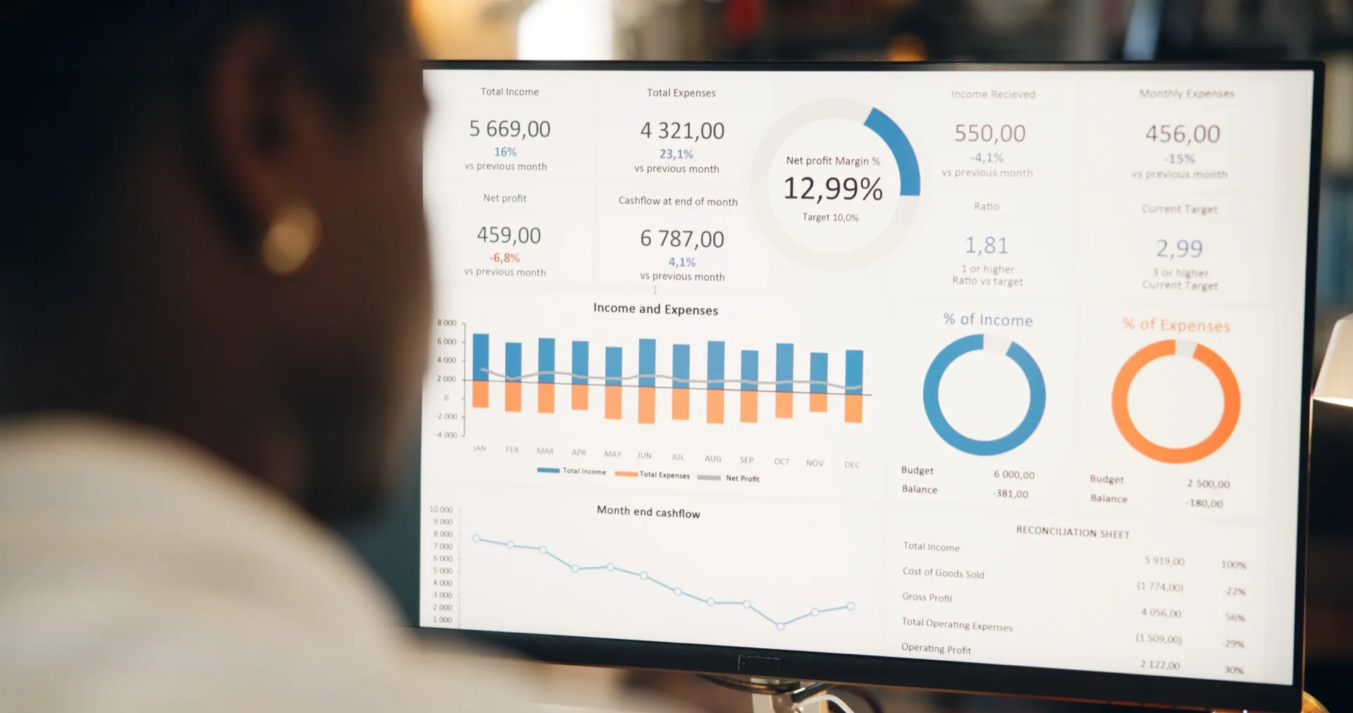
The Dashboard Everyone Builds and No One Opens
Every logistics company has dashboards. Very few have dashboards that executives actually open every morning. The gap between building a dashboard and building one that drives decisions is enormous, and it has almost nothing to do with technology. It has everything to do with understanding what executives need versus what analysts think they need.
The typical failure pattern looks like this: the data team builds a comprehensive dashboard with every metric they can extract from the TMS. It has 15 tabs, 40 charts, and drill-down capability into individual shipment records. The analysts love it. The executives open it once, get overwhelmed, and go back to asking their operations manager for a verbal update. Three months later, the dashboard is abandoned, and the company concludes that "BI doesn't work for us."
The problem is not the data or the technology. The problem is design philosophy. Executive dashboards must be built top-down, starting from the decisions executives actually make, not bottom-up from the data that happens to be available.
Executives Consume, Analysts Explore
Executives and analysts have fundamentally different relationships with data. Analysts explore data to discover insights. Executives consume insights to make decisions. This distinction should drive every design choice in your dashboard.
An analyst wants flexibility — the ability to filter, pivot, drill down, and explore freely. An executive wants clarity — the ability to see the current state of the business in 30 seconds, identify anything requiring attention, and move on. If your dashboard requires more than 30 seconds to scan, it is too complex for executive use.
Design Principles for Executive Logistics Dashboards
Principle 1: Start With Decisions, Not Data
Before opening any design tool, list the top five to seven decisions your executives make on a weekly or monthly basis. For a logistics company these usually cluster around a handful of things: whether margin targets are being hit, which customers or trade lanes need attention, how carriers are performing, whether volume is growing or shrinking, and whether any operational crisis needs immediate attention.
Each decision maps to 2-3 KPIs. Margin targets map to gross freight margin and margin trend. Customer attention maps to customer profitability ranking and volume changes. Carrier performance maps to on-time delivery and cost variance. This exercise will give you 10-15 KPIs — and that is your entire executive dashboard. Nothing more.
Principle 2: Use the 5-Second Rule
Every element on your dashboard should communicate its message within 5 seconds. If a chart requires a legend, axis labels, and contextual explanation to interpret, it is too complex. Use large numbers with directional indicators (up/down arrows, green/red coloring) for KPIs. Use sparklines for trends. Use bar charts only when comparing a small number of categories (5-7 maximum).
Avoid pie charts entirely — they are notoriously difficult to interpret accurately. Avoid tables with more than 10 rows. Avoid any visualization that requires scrolling. The executive dashboard should fit on a single screen without scrolling, regardless of the display size.
Principle 3: Context Over Data Points
A number without context is meaningless. Showing that your gross margin is 18.3% tells an executive nothing unless they know whether that is good, bad, improving, or declining. Every KPI on your dashboard needs three layers of context: the current value, the trend (compared to the previous period), and the benchmark (target, budget, or industry average).
The most effective format is a KPI card that shows the current value prominently, a small trend indicator showing the change from the prior period, and color coding against the target (green for on-track, amber for warning, red for alert). This format lets executives scan 10-15 KPIs in under 30 seconds and immediately identify which areas need their attention.
Principle 4: Progressive Disclosure
Executives do not need drill-down capability in their primary view, but they do need it available on demand. The best approach is progressive disclosure — a clean summary view with the ability to click into details when something catches their attention. Clicking on a declining margin KPI should open a view showing margin by trade lane. Clicking on a trade lane should show margin by customer within that lane. Each click adds one level of detail.
This layered approach satisfies both the executive need for simplicity and the occasional need for deeper investigation. Syntask implements this pattern through clickable KPI cards that expand into detailed analysis views, keeping the primary dashboard clean while providing depth on demand.
Proof, not a pilot
Put this to work on your own operational data.
No integration project. No black box.
Start a 90-Day Proof of ValueSelecting the Right KPIs
The temptation to include every available metric is the single biggest threat to dashboard usability. Fight it ruthlessly. A dashboard with 30 KPIs is not more informative than one with 10 — it is less informative because the important signals are lost in noise.
Apply these filters to every proposed KPI:
- Actionable: Can the executive take a specific action when this metric moves? If the answer is "it's good to know," it does not belong on the executive dashboard.
- Timely: Does this metric change frequently enough to warrant dashboard placement? Metrics that move quarterly belong in quarterly reports, not on daily dashboards.
- Understandable: Can the executive explain this metric to a board member without technical assistance? If it requires a footnote, simplify or remove it.
- Non-redundant: Does this metric tell a different story from others already on the dashboard? Revenue and revenue per shipment are related but tell different stories. Revenue and gross revenue are redundant.
Data Refresh and Performance
Nothing kills dashboard adoption faster than stale data or slow load times. If an executive opens a dashboard and sees data from last week, they will revert to asking for manual updates. If the dashboard takes 15 seconds to load, they will check email instead.
For executive logistics dashboards, aim for the following refresh cadence:
- Operational KPIs (shipment volume, OTD, exceptions): refresh every 1-4 hours
- Financial KPIs (margin, revenue, cost): refresh daily, typically overnight batch
- Strategic KPIs (market share, customer concentration): refresh weekly
Load time should be under 3 seconds for the primary view. This may require pre-aggregating data rather than running complex queries on demand. Most modern BI platforms, including Syntask, handle this through materialized views or caching layers that keep the dashboard responsive even with large datasets.
Driving Adoption
Building the dashboard is only half the battle. Driving consistent executive adoption requires deliberate effort. Start by making the dashboard the opening slide of every management meeting. When executives see their peers referencing dashboard data in discussions, it establishes the platform as the authoritative source. Remove competing reports — if a manual Excel report covers the same metrics, retire it. Dual reporting undermines trust in both sources.
Collect feedback aggressively in the first month. Watch executives use the dashboard and note where they hesitate, squint, or ask for clarification. Each of those moments is a design flaw to fix. A dashboard that evolves based on actual user behavior will achieve far higher adoption than one designed in isolation and delivered as a finished product.
The ultimate measure of success is not whether the dashboard exists, but whether it changes behavior. When executives start referencing specific metrics in their decisions, when meeting discussions shift from opinions to data, and when the first question in a review is "what does the dashboard show?" — you have built a logistics dashboard that executives actually use.
Put this to work on your own operational data.
Start with one lane, one workflow, one decision. Measure impact. Expand when value is proven.
No integration project. No black box.
Written by
Berna Bulgurcu
Co-founder & CEO, Syntask
The Syntask team writes about operational decision intelligence for logistics — turning the data teams already have into prioritized, evidence-backed decisions.
Topics
- Business Intelligence
- For CFOs
- How-To Guide