How to Set Up Your First BI Dashboard in 30 Minutes
You do not need weeks of implementation to get started with BI. This step-by-step guide walks you through setting up your first actionable dashboard in under 30 minutes.

Why Most BI Implementations Take Too Long
Enterprise BI deployments are often quoted in months, not weeks. Requirements gathering, data modeling, ETL pipeline development, dashboard design, user acceptance testing, training — each phase adds time. By the time the dashboard is live, the business questions it was built to answer may have moved on.
That timeline is not inevitable. It is usually a symptom of overengineering the first release. Teams try to build the comprehensive dashboard on day one, then stall on data-quality debates and creeping scope. What ships is either late or so dense that nobody opens it twice.
A better approach is to start small, validate fast, and iterate. Your first dashboard does not need to answer every question. It needs to answer one important question better than your current method (usually a spreadsheet) and prove that the data pipeline works. Everything else can be added later.
Pick One Question Worth Answering Daily (5 Minutes)
Resist the temptation to list 20 KPIs. Pick one question that, if answered daily with current data, would improve your decision-making. For logistics companies, the most common high-value starting questions are:
- "What is our margin by lane this week?" — Identifies where money is being made or lost
- "Which shipments are currently delayed?" — Enables proactive exception management
- "How does our actual carrier cost compare to contracted rates?" — Catches billing overcharges
- "What is our volume trend by customer over the last 90 days?" — Spots churn risk early
Pick one. Write it down. This is the single metric your first dashboard will answer. You can expand later, but starting with focus dramatically increases your chances of delivering something useful on day one.
The "One Screen" Rule
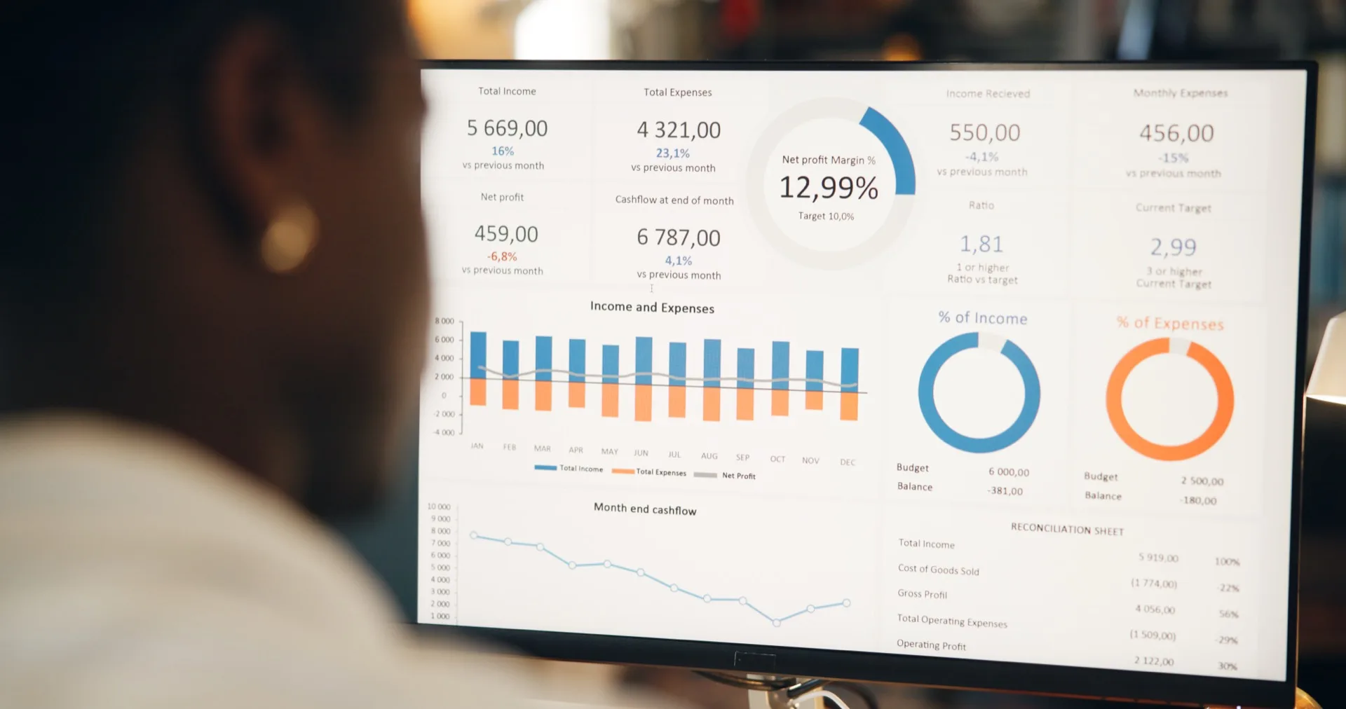
Your first dashboard should fit on one screen without scrolling. If it requires scrolling, it has too many elements. One primary chart, one summary table, and two to three KPI cards is the right scope. This constraint forces prioritization and ensures the dashboard is scannable at a glance.
What Data Source Should You Connect First?
Modern BI platforms like Syntask support direct connections to common logistics data sources: TMS platforms, ERP systems, accounting software, and spreadsheets. The fastest path to a working dashboard depends on where your data lives:
- If your data is in a TMS with API access: Connect the API directly. Syntask auto-discovers available data fields and begins syncing immediately. No manual mapping required for standard fields
- If your data is in spreadsheets: Upload a CSV or Excel file. The platform detects column types (dates, currencies, text, numbers) and creates a queryable dataset within seconds. You can automate future uploads via email or shared folder
- If your data is in an ERP or accounting system: Use the platform's pre-built connectors for common systems (SAP, Oracle, QuickBooks, Xero). These connectors handle authentication, data mapping, and incremental syncing
The key principle is to connect what you have, not what you wish you had. If your shipment data is in a spreadsheet with inconsistent column names, connect it anyway. Cleaning and standardizing data is important, but it should not block your first dashboard. A slightly messy dataset that provides insight today is more valuable than a perfectly clean dataset that arrives next month.
Proof, not a pilot
Put this to work on your own operational data.
No integration project. No black box.
Start a 90-Day Proof of ValueAssemble the One Screen (10 Minutes)
With your data connected and your question defined, building the dashboard follows a straightforward process:
Create the primary visualization: For margin by lane, a bar chart sorted by margin percentage works well. For delayed shipments, a table with color-coded status indicators is most useful. For cost comparison, a variance chart showing actual versus contracted rates communicates the gap immediately. Choose the chart type that answers your question most directly.
Add context metrics: Surround the primary chart with 2-3 KPI cards that provide context. If your primary chart shows margin by lane, add cards for total revenue, total margin, and average margin percentage. These provide the aggregate context that makes the lane-level detail meaningful.
Set up filters: Add a date range selector and any relevant categorical filters (mode, carrier, customer). Filters let users explore the data without requiring multiple dashboard versions. Keep filters simple — 2-3 maximum for the first version.
Syntask's drag-and-drop dashboard builder handles the formatting and responsive design automatically. You focus on choosing the right metrics and visualizations; the platform handles layout, labeling, and interactivity.
Put It in Front of Three People (5 Minutes)
A dashboard only you look at is a personal spreadsheet with nicer formatting. Share it right away with at least three people who would act on what it shows. Ask them two things: is this useful, and what is the one item you would add?
Their answers guide your iteration. If the margin-by-lane dashboard is useful but everyone asks for customer breakdown, add a customer filter in the next iteration. If delayed-shipments is useful but people want estimated delivery dates, add an ETA column. Each iteration takes minutes, not weeks, because you are adding to an existing foundation rather than building from scratch.
Schedule the dashboard to refresh automatically and send a summary email daily or weekly. This keeps the data in front of decision-makers without requiring them to remember to check the dashboard. Push beats pull for adoption — especially in the early stages when the habit of checking analytics is still forming.
From First Dashboard to Analytics Culture
Your first dashboard is a starting point, not a finish line. Once people see that current data is accessible and answers a real question, they start asking more. Those questions turn into new views and new workflows. In the months after a first dashboard goes live, most teams accumulate a handful of additional views covering different corners of their operation.
The critical success factor is speed of iteration. When someone asks a new question, the answer should appear in the dashboard within days, not months. Syntask's natural language querying and AI-powered dashboard suggestions accelerate this cycle — users can type a question and receive a visualization without any technical configuration, then save it as a permanent dashboard element if it proves valuable.
Ship the first dashboard today. It will be rough and incomplete, and it will still be far more useful than the comprehensive dashboard that never ships.
Put this to work on your own operational data.
Start with one lane, one workflow, one decision. Measure impact. Expand when value is proven.
No integration project. No black box.
Written by
Berna Bulgurcu
Co-founder & CEO, Syntask
The Syntask team writes about operational decision intelligence for logistics — turning the data teams already have into prioritized, evidence-backed decisions.
Topics
- Business Intelligence
- For Operations Managers
- How-To Guide
- Checklist